
Modern Web Design Trends in 2025: Bento Grids, Glassmorphism & AI UI
The visual language of the web is undergoing a seismic shift. Explore how top design teams and AI tools are blending modular architecture, tactile depth, and generative assets to create modern, high-converting digital experiences.

The Evolution of Web Aesthetics in 2025
Web design in 2025 is no longer about static templates or generic framework themes. Users expect web pages to be fast, responsive, visual, and highly interactive. The convergence of browser performance APIs, GPU acceleration, and generative AI has unlocked visual possibilities that were previously restricted to native mobile applications.
Whether you are redesigning an existing SaaS marketing page, revamping a developer portfolio, or building an e-commerce storefront from scratch, adopting current design trends is essential for building user trust and maximizing conversion rates.
4 Key Visual Trends Defining 2025 Websites
 01
01Bento Grids & Asymmetric Modular Layouts
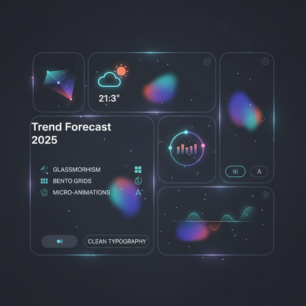
Pioneered by Apple's technical specs and refined by modern SaaS platforms like Linear and Framer, Bento Grids organize complex product value props into clean, modular visual compartments. They eliminate scroll fatigue by packing high-density information into intuitive, digestible boxes.
 02
02Glassmorphism & Depth Layering
Modern digital interfaces have moved past flat 2D elements. By leveraging backdrop-filter blurs, multi-layered subtle borders, and ambient light drops, glassmorphism provides a tactile sense of physical depth while maintaining high readability across dark and light modes.
 03
03Generative AI Assets & Contextual Visuals
Static stock photography is being rapidly replaced by dynamic AI-generated vector graphics, custom 3D renders, and real-time generative heros. Web applications now craft personalized visual assets on the fly that mirror specific user intent.
 04
04Dark-Mode First & High-Contrast Typography
Dark interfaces are no longer an optional toggle; they are the primary default experience for developer tools, SaaS platforms, and digital products. Pair deep slate/obsidian canvases with high-contrast, oversized sans-serif typography for maximum visual impact.
How to Implement a 2025 Bento Grid in CSS
Building a modern Bento Grid layout requires CSS Grid container properties combined with responsive breakpoints. Here is a production-ready snippet used in modern SaaS redesigns:
/* 2025 Responsive Bento Grid Layout */
.bento-grid {
  display: grid;
  grid-template-columns: repeat(12, 1fr);
  gap: 1.5rem;
}

.bento-card-large {
  grid-column: span 8;
  background: rgba(30, 41, 59, 0.4);
  backdrop-filter: blur(16px);
  border: 1px solid rgba(245, 158, 11, 0.2);
  border-radius: 1.5rem;
  padding: 2rem;
}

.bento-card-small {
  grid-column: span 4;
  background: rgba(15, 23, 42, 0.8);
  border: 1px solid rgba(255, 255, 255, 0.1);
  border-radius: 1.5rem;
  padding: 2rem;
}

@media (max-width: 768px) {
  .bento-card-large, .bento-card-small {
    grid-column: span 12;
  }
}
Web Design Trend Roadmap (2025–2026)
Generative AI Heros
Integration of prompt-driven visual engines to dynamically render customized hero illustrations per visitor session.
Scroll-Driven Animations
Widespread adoption of native CSS `@scroll-timeline` animations replacing bloated JavaScript motion libraries.
Spatial 3D Web UI
Lightweight WebGL & Three.js ambient environments tailored for spatial browser viewports and desktop displays.
Design trends divide into two kinds: conventions that solved a real problem and stayed, and fashions that cycled through and dated the sites that adopted them hardest. Telling them apart while they are current is difficult, and there is a reasonably reliable test.
The test: does it solve a problem or signal recency?
Trends that persist almost always started as answers to a genuine constraint. Responsive layout solved phones. Larger type solved readability on high-density screens. Dark mode solved reading in low light and battery use on OLED displays.
Trends that date started as signals — a way of showing that a site was built recently. Skeuomorphic textures, heavy bevels, parallax scrolling, full-screen splash animations. Each was briefly a marker of currency and then became a marker of the year it was applied.
When you see a new pattern, ask which it is. If you cannot name the problem it solves, it is probably a signal, and signals expire.
What has become baseline
These are no longer trends. They are what a site is now assessed against, and their absence is noticeable in a way their presence is not.
One fluid responsive layout rather than a desktop design with a mobile variant. Body text at sixteen pixels or above with generous line height. A type scale where hierarchy is obvious at a glance. Restrained colour with a single accent. Visible focus states. Dark mode support, increasingly expected rather than admired.
None of these will make a site look impressive. All of them will make it look neglected if missing.
Current patterns worth adopting selectively
Large type and generous whitespace continue to work, because they serve readability rather than novelty — though "generous" becomes "empty" past a point, and a hero occupying an entire screen while burying the offer is a fashion pretending to be a convention.
Subtle motion that communicates state — something appearing, a transition indicating where a panel came from — is useful. Motion that exists to be noticed is the parallax of this cycle and will date the same way.
Bento-style grid layouts are currently everywhere. They work well for genuinely heterogeneous content and badly as a way of arranging items that would have been a list.
Patterns that have quietly reversed
Worth noting because sites built at the peak of these still carry them.
Placeholder-only form fields, where the label vanishes on focus, were widespread and failed accessibility and usability badly enough that persistent labels have returned.
Hamburger menus on desktop, hiding navigation behind an icon on screens with room to display it, reduced discoverability for no benefit.
Infinite scroll on content sites made things impossible to find again and broke the footer. And carousels remain widely built and consistently ineffective — they resolve internal disagreement about what goes first rather than serving readers.
How to adopt without dating your site
A practical division: apply trends to the surface, never to the structure.
Colour, type treatment and imagery style are cheap to change later. Layout architecture, navigation patterns and component structure are expensive, so those should follow conventions rather than fashion.
A site whose structure is conventional and whose surface is current can be refreshed in an afternoon when the surface dates. A site whose structure encodes a trend requires a rebuild.
- Surface: follow fashion — colour, type treatment, imagery. Cheap to change.
- Structure: follow convention — layout, navigation, components. Expensive to change.
- Ask what problem it solves — if you cannot name one, it is a signal, and signals expire.
- Refresh on a cadence — annually on the surface beats a rebuild every five years.
The thing that never dates
Clarity. A site where a visitor immediately understands what is offered, who it is for and what to do next does not go out of fashion, because it was never in fashion.
Most of what reads as "dated" in practice is not a stale trend at all — it is inconsistency accumulated over years, and consistency is not a trend either.
Which suggests the most durable advice available: get the fundamentals right and apply a light current surface over them, rather than chasing the pattern that will identify the year your site was built.
Ask what problem a trend solves; if you cannot name one, it is a recency signal and it will expire. Follow fashion on the surface and convention in the structure — the surface is cheap to change and the structure is not.
Frequently Asked Questions
What are the most dominant web design trends for 2025?
The most impactful web design trends of 2025 include Bento Grid modular layouts, Glassmorphism with backdrop filters, Dark-mode first UI systems, AI-generated custom visual assets, and high-performance micro-animations driven by scroll APIs.
Why are Bento Grids so popular in SaaS web design?
Bento Grids allow product teams to present complex feature suites in an organized, scannable format. By grouping features into rounded visual cards of varying sizes, users can absorb key details at a glance without reading long paragraphs.
How does AI impact modern visual website design?
AI automates the translation of text descriptions into clean, production-ready code. Instead of spending weeks manually building CSS flexboxes or Figma mockups, platforms like Redesignr.ai generate responsive layouts with contemporary styling instantly.
Can I automatically apply 2025 design trends to an old website?
Yes. Using Redesignr.ai, you can enter any existing URL, select an aesthetic theme like 'Bento Grid SaaS' or 'Glassmorphic Dark Mode', and AI will parse the structure and output a modernized version in clean HTML/CSS or React.
Upgrade Your Website to 2025 Design Standards
Don't let an outdated visual layout hold back your conversion rates. Redesignr.ai instantly analyzes your website and generates a modern, responsive design complete with clean HTML/CSS.
Redesign Your Website Now