
Landing Page Optimization with AI: Maximize Conversions
Turn low-converting landing pages into high-yielding lead engines using automated AI layout optimization and clean React code exports.
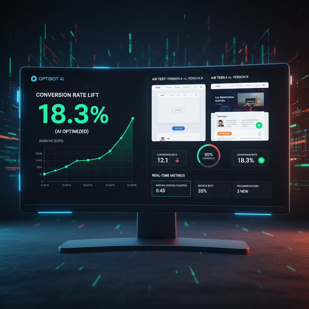
The Impact of AI on Landing Page Conversion Rates
Driving paid PPC ad traffic to an un-optimized landing page is like pouring water into a leaking bucket. If your page takes more than 3 seconds to load or fails to clearly state its value proposition above the mobile fold, prospective leads will bounce immediately.
Traditional landing page optimization involved running slow A/B tests over months to determine minor button placement changes.
Modern generative AI platforms automate conversion rate optimization by reorganizing visual hierarchies, balancing color contrast tokens, and placing high-value proof badges directly in the user's primary line of sight.
Leveraging automated DOM parsing allows growth teams to continuously refine copy messaging and layout elements without re-hiring design agencies.
Redesignr.ai accelerates landing page optimization—ingesting existing page URLs and compiling mobile-first, high-converting HTML/React code components automatically.
4 Core Pillars of AI Landing Page Optimization
1. Problem-Agitate-Solve (PAS) Headline Copywriting
Redesignr automatically restructures landing page hero sections around high-converting PAS copywriting frameworks, capturing visitor attention in the critical first 3 seconds.
2. Mobile-First CTA Button & Form Placement
Ensure primary call-to-action buttons are positioned above the fold on mobile viewports with high-contrast color tokens and simplified form fields.
3. Bento Grid Visual Feature Breakdown
Replace long walls of paragraph text with scannable Bento Grid card containers complete with dark mode backdrop filters and custom vector icons.
4. PageSpeed Core Web Vitals Optimization
Redesignr exports lightweight HTML5, CSS3, and React component code that loads in under 1.5 seconds, eliminating mobile bounce rates caused by slow scripts.
Optimisation is what happens after a page is live, and it is a different discipline from designing one. It is mostly about deciding what to measure, changing one thing at a time, and being honest about how much of what you observe is noise. Automation helps with producing the variants; it does not help with the judgement.
Measure the right thing
Conversion rate is the obvious metric and it is frequently the wrong one on its own, because it can be improved by attracting fewer, better-qualified visitors — which looks like success and may reduce total conversions.
Watch the absolute number alongside the rate. And where you can, watch what happens after the conversion: leads that never respond, trials that never activate. A page optimised for form fills can produce more leads and less revenue.
Bounce rate deserves particular scepticism. A visitor who got their answer immediately and left is indistinguishable from one who fled, and treating the metric as a quality signal leads to changes that make the page worse.
Change one thing, or you learn nothing
The temptation is to change the headline, the image, the form and the button together, because it is faster. If the number moves you will not know which change caused it, and you cannot apply the finding anywhere else.
One change at a time is slower and produces knowledge that transfers. If a shorter form works on this page, that is worth knowing for every page.
The exception is a page that is clearly failing, where a wholesale replacement is justified because you are not optimising, you are starting over. Be clear with yourself about which one you are doing.
Test in order of expected impact
Most tests produce no detectable difference, so the order matters more than the volume of tests.
The headline and opening section move the number most often, because they decide whether people stay at all. Form length is next — each removed field is a removed reason to abandon. The call to action wording, particularly moving from vague to specific, is a small reliable win. Page speed matters more than most people expect on paid traffic.
Button colour is famous and near the bottom. It gets tested constantly because it is easy, which is not the same as being important.
- Headline and opening — decides whether anyone stays. Test first.
- Form length — every field removed is a reason to abandon removed.
- Call to action wording — specific beats vague, reliably if modestly.
- Page speed — particularly on paid mobile traffic, where you bought the visitor.
Be honest about significance
Most landing pages do not get enough traffic for a rigorous test to conclude in a reasonable time, and pretending otherwise produces confident wrong conclusions.
If you have a few hundred visitors a week, a small difference will never be detectable and stopping the moment one variant is ahead is how you convince yourself of a coin flip.
At low volume, the honest approach is to test only changes large enough to produce an obvious difference, and otherwise rely on judgement and known principles rather than pretending to measure. That is not a failure — it is an accurate assessment of what your data can support.
Look at recordings before hypothesising
Quantitative data tells you that people leave; it does not tell you why. Ten session recordings usually will, and they cost nothing but attention.
You will see people scroll past the section you thought was the argument, hesitate at a specific form field, or hunt for information that is not on the page. Those observations generate better hypotheses than staring at a funnel chart.
Support tickets and sales call notes do the same job. The questions people ask before buying are precisely the questions the page failed to answer.
Where generation fits
It removes the production cost of variants, which was the reason most tests never ran.
That is genuinely useful and it does not touch the hard parts: deciding what to test, interpreting the result honestly, and knowing when your traffic cannot support a conclusion.
The risk is testing more because it became cheap rather than because the tests are worth running. Cheap variants make it easy to generate a great deal of activity and very little knowledge.
Watch absolute conversions rather than rate alone, change one thing at a time, test the headline and form before the button colour, and be honest about whether your traffic can support a conclusion at all.
Frequently Asked Questions
How does AI optimize landing pages for higher conversion rates?
AI landing page optimization tools analyze user visual scannability, structure content into proven copywriting frameworks, and apply mobile-first CSS grid layouts that guide visitors toward completing primary lead forms.
Can I optimize an existing landing page URL with Redesignr.ai?
Yes. Redesignr ingests your existing live URL, extracts brand assets and text copy, and outputs a modernized, high-converting layout in under 30 seconds.
Do I get exportable React code for my optimized landing page?
Yes. Redesignr outputs standalone, un-obfuscated React component code and static HTML files that you can host on Vercel, Netlify, or custom servers.
Optimize Your Landing Page Now
Enter your landing page URL into Redesignr.ai to generate an optimized, high-converting layout in seconds.
Start Landing Page Optimization