
AI Redesign for Old Websites: Modernize Legacy UX
Transform dated 2000s web pages into sleek, mobile-responsive, high-converting React websites automatically using Redesignr.ai.
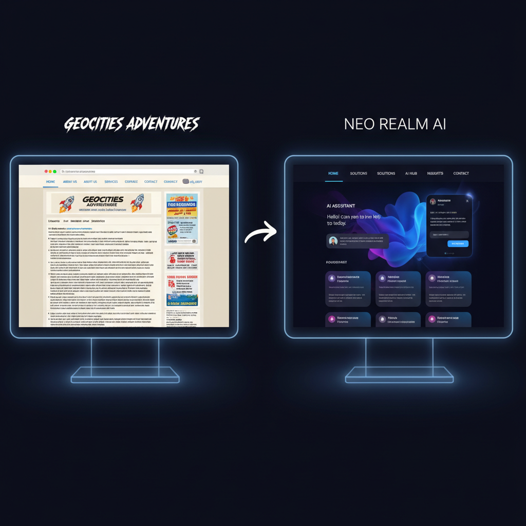
The Business Risk of Legacy Web Interfaces
Websites built over a decade ago suffer from accumulating user experience friction. Outdated typography, missing mobile breakpoints, cluttered navigation links, and slow loading times erode visitor trust and destroy conversion rates.
Many small business owners hesitate to modernize legacy sites out of fear of breaking underlying server code or spending thousands of dollars on web agency retainers.
Redesignr.ai provides a risk-free modernization path—ingesting existing website URLs and outputting clean, mobile-responsive HTML/React code while preserving your brand content and SEO rank equity.
4 Core UX Improvements Applied by AI
1. Modern Responsive Grid Systems & Touch Accessibility
Legacy 2000s websites rely on rigid HTML tables and fixed pixel widths that clip on smartphones. Redesignr compiles responsive CSS flexbox and grid layouts with accessible touch targets.
2. Clean Dark Mode & High-Contrast Typography
Replace low-contrast grey text on white backgrounds with modern 2026 dark mode themes, high-contrast font pairings, and scannable Bento Grid card containers.
3. PageSpeed & Core Web Vitals Optimization
Old sites often contain heavy un-minified JavaScript scripts and outdated image formats. Redesignr exports lightweight HTML5, CSS3, and React code that loads in under 1.5 seconds.
4. Preservation of SEO Link Equity & Content
Redesignr retains your existing heading tags, text copy, image alt attributes, and canonical URL structures while updating the underlying visual presentation layer.
Benefits of Modernizing Old Web Code
1. 100% Mobile Responsive Breakpoints
Ensure your web pages render cleanly across smartphones, tablets, and desktop displays without horizontal scrollbars or clipped text.
2. Standalone Code Ownership
Export standard HTML, CSS, and React code that you can host on any provider without vendor lock-in.
Older sites tend to share a set of usability problems that are separate from how they look. A site can be visually updated and still be difficult to use, because these faults live in navigation, forms and interaction patterns rather than in typography and colour.
Navigation built for a different era
The most common structural fault is a menu that grew rather than being designed. Eleven top-level items, several of which are organisational rather than useful — "Solutions", "Resources", "Company" — with the thing people actually want two levels down.
Older sites also frequently place primary navigation in a left sidebar, which was conventional and now costs horizontal space that mobile layouts cannot spare.
The fix is editorial rather than visual: cut the top level to the routes people actually take, name them after what they contain rather than after your org chart, and move everything else to the footer. Analytics will tell you which is which.
Forms designed for the site's convenience
Old forms ask for more than they need, because fields accumulate and nobody removes them.
The patterns to look for: fields that exist for internal routing rather than to serve the visitor, required fields that could be optional, separate first and last name inputs, address forms that force a format, and a phone number field on an enquiry form that only exists so somebody can call rather than email.
Each field costs completions. The question worth asking of every one is whether the answer would change your response — and if not, it can be gathered later in a conversation.
Interaction patterns that have been superseded
Several patterns that were normal are now actively obstructive, particularly on touch devices.
Hover-activated dropdown menus, which have no touch equivalent and become unreachable on a phone. Modal windows that cannot be dismissed on a small screen. Carousels holding content people never see past the first slide. Anything requiring precise mouse positioning.
These are not aesthetic complaints. A hover-only menu on a site where most traffic is mobile means a substantial share of visitors cannot reach parts of the site at all.
Findability, which is usually the real complaint
When people say an old site is hard to use, they most often mean they could not find something.
That comes from a few specific things: page titles that describe the organisation rather than the content, no search or a search that returns nothing useful, content buried several levels deep, and no obvious route from a deep page back to related material.
A useful exercise is to pick the five things visitors most often need and count the clicks from the homepage. If any of them takes more than two, that is the redesign brief — and it is a structural fix rather than a visual one.
Accessibility debt accumulates quietly
Old sites were frequently built before accessibility was routinely considered, and the failures are consistent enough to check quickly.
Missing alternative text. Form inputs without associated labels. Focus indicators removed for looking untidy. Colour used as the only means of conveying information. Content unreachable by keyboard. Contrast that was acceptable on a CRT and is not on a phone in daylight.
An automated checker finds most of these in about a minute, which makes this the cheapest genuine improvement available on most old sites.
- Alt text on informative images — decorative ones can be empty; informative ones cannot.
- Labelled form fields — persistent labels, not placeholders that vanish.
- Visible focus states — removed in most old stylesheets for tidiness.
- Keyboard reachability — tab through the page and see where you get stuck.
Fix usability before appearance
The tempting order is the reverse, because visual improvement is visible and satisfying.
But a beautiful site with an eleven-item menu and a nine-field form is still hard to use, and you will have spent the budget on the half that was not the problem.
Work through navigation, forms and findability first — those are largely editorial decisions and cost little to make. Then apply the visual work on top of a structure that is worth presenting well.
Old sites fail on navigation depth, over-long forms, hover-dependent interactions and accessibility debt — none of which a visual refresh touches. Fix the structure first, then make it look current.
Frequently Asked Questions
Can AI modernize a website built 10 to 15 years ago?
Yes. Redesignr.ai ingests legacy website URLs, parses DOM text structures and brand assets, and generates modern responsive React components in under 30 seconds.
Will updating an old website design hurt my existing search engine rankings?
No. Redesigning with Redesignr preserves your canonical URLs and text content while improving mobile page speed, which directly boosts Google SEO rankings.
How much does it cost to redesign an old website with AI?
AI website redesigns cost a fraction of traditional agency retainers, replacing $5,000+ agency quotes with instant credit-based visual code generation.
Modernize Your Old Website Today
Enter your website URL into Redesignr.ai to generate a sleek, modern visual makeover in seconds.
Redesign Old Website Now