
AI Landing Page Design: From URL to High Conversion
Discover how Redesignr.ai transforms outdated landing pages into sleek, mobile-first, high-converting React websites in seconds.
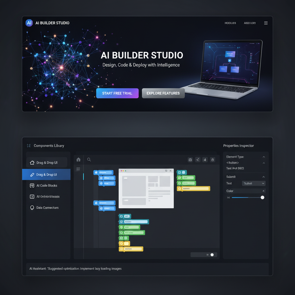
The Science of Generative Landing Page Design
Designing a high-converting landing page is one of the most critical challenges for SaaS founders, growth marketers, and digital agencies. A poorly structured page with vague headline copy, broken mobile alignment, or slow loading speeds wastes precious PPC ad budgets.
Traditional landing page design workflows involved coordinating copywriters, Figma visual designers, and front-end developers over weeks of revisions.
Modern AI landing page design platforms accelerate this timeline dramatically by automating visual component hierarchy, color token balancing, and mobile responsive container rules.
Redesignr.ai streamlines this entire process—ingesting live website URLs or text prompts and outputting conversion-optimized, mobile-responsive React landing page code in seconds.
4 Core Components of an AI-Designed Landing Page
1. Automated Value Proposition Framing
Redesignr's copy synthesis engine analyzes your product offer and target audience, generating high-converting hero headlines, subheadings, and primary call-to-action button hooks based on proven marketing frameworks.
2. Bento Grid Feature Card Architecture
Organize core product capabilities into scannable Bento Grid card containers complete with dark mode glassmorphism backdrop filters, custom vector icons, and responsive column scaling.
3. Social Proof & Trust Seal Carousels
Embed customer review cards, client logos, star ratings, and security trust seals above the fold to eliminate purchasing friction and build instant user trust.
4. Standalone React & HTML Code Export
Export 100% standalone, production-ready React component code and static HTML/CSS files. Host your landing page on Vercel, Netlify, Cloudflare Pages, or custom web servers with zero vendor lock-in.
Conversion Rate Optimization (CRO) Best Practices
1. Clear Hero CTA Placement & Contrast
Position high-contrast call-to-action buttons directly above the fold on mobile viewports to minimize scroll friction for first-time visitors.
2. Mobile-First PageSpeed Architecture
Export lightweight React code components that pass Google Core Web Vitals, ensuring sub-1.5-second load times on mobile connections.
Landing pages have a conventional anatomy, and the convention exists because the sequence does work rather than because everyone copies each other. Understanding what each section is for tells you which ones your page can skip and which ones it cannot — which is more useful than a template.
The sequence is an argument, not a set of blocks
A landing page moves a reader through four steps: this is what it is, here is why you should believe it, here is why your objection is handled, here is what to do.
Sections are not interchangeable. Proof placed before the claim it supports has nothing to attach to. Objection handling before the reader has formed the objection introduces doubt rather than resolving it. The call to action before the argument asks for a decision nobody is ready to make.
This is why generated pages assembled from a component library often feel wrong even when every component is good. The parts are fine; the order is arbitrary.
Above the fold: three things, quickly
What this is, in plain words. Who it is for. What happens if you act.
The most common failure is a headline that is positioning rather than description — clever, and it leaves a first-time visitor unsure what they are looking at. If a reader cannot tell within a few seconds whether this is relevant to them, everything below is wasted.
A visual helps if it shows the actual thing. A product screenshot, the interface, the result. A stock photograph of people in a meeting is decoration and occupies the most valuable space on the page.
And the primary action should be visible here, even though most people will not take it yet. Its presence tells them what the page is for.
Proof, and why most of it is worthless
Proof only works when it is specific enough to be checkable. Generic trust signals are discounted automatically because readers know how cheap they are to produce.
A named customer with a named person and a concrete outcome beats twenty unattributed logos. A screenshot of the thing working beats a claim that it works. A number you will stand behind beats "trusted by thousands".
If you cannot name customers, describe situations: the industry, the size, the problem, what changed. Specificity is what does the work; identity is one way of achieving it, not the only one.
Handle the objection you would rather not mention
Every offer has one — price, switching cost, whether it works for a situation like theirs, whether you will still exist next year.
Pages routinely avoid it, and avoidance does not remove the objection; it removes your chance to answer it. The reader still has the thought, and now they have it with no response.
This is what an FAQ section is genuinely for, as opposed to being a place to repeat features as questions. Write down the three things a sceptical buyer actually worries about and answer them plainly. It is usually the highest-leverage section on the page and the one that gets the least attention.
One action, repeated
One thing to do, offered several times as the page gets long, with the same wording each time.
Multiple different actions of equal weight — start a trial, book a demo, download a guide, join the newsletter — force a choice the visitor did not come to make, and the common response to a forced choice is to make none.
Be specific in the label. "Get started" describes nothing; "Start a free 14-day trial" tells them exactly what happens next, which removes the hesitation that a vague label creates.
What to cut
Landing pages fail more often from too much than too little.
Navigation, because every link away is a leak on traffic you paid for. Your company history, which nobody on a campaign page cares about. Feature lists that duplicate what the proof section already demonstrated. Any section that exists because a stakeholder asked for it rather than because it advances the argument.
A useful test on each section: if this were removed, would the reader be less likely to act? If not, it is occupying attention it has not earned.
Claim, proof, objection, action — in that order, with one thing to do. Cut the navigation and anything that does not make the reader more likely to act.
Frequently Asked Questions
How does AI improve landing page design conversion rates?
AI landing page generators structure content around conversion rate optimization (CRO) best practices—placing value proposition hooks, social proof badges, and mobile-responsive CTA buttons where users naturally look.
Can Redesignr.ai ingest an existing landing page URL to redesign it?
Yes. Redesignr ingests any live URL or mockup screenshot, parsing text copy and visual layout structures to generate a modernized, mobile-responsive page in under 30 seconds.
Do I own the exported landing page code?
Yes. You have complete ownership of all exported React and HTML/CSS code files, allowing you to deploy and customize your landing page without recurring platform subscription fees.
Design High-Converting Landing Pages Now
Enter your website URL into Redesignr.ai to generate a fresh, modern landing page in seconds.
Start AI Landing Page Design